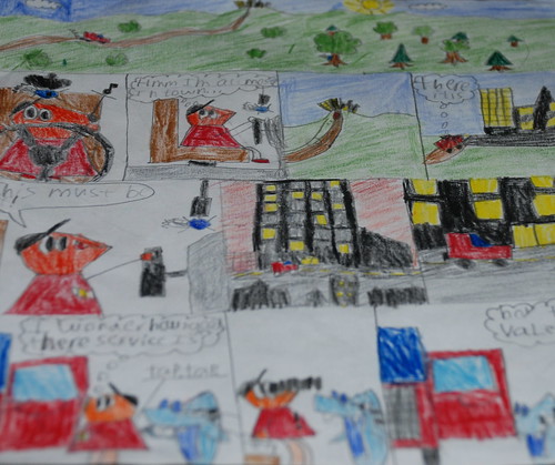
Paul has been working on this for days. He is so proud of his careful coloring and measured squares. When I complimented him on this work of art, he said, "Maybe it will make your picture of the day."
How could I deny him that simple pleasure?
I took picture after picture and was frustrated with every shot! Paul said, "Mom, give me the camera." In one shot he had it. So, even though I didn't take it, I had to include his picture (of his picture) and eat humble pie.
9 comments:
Too cute! My kids are totally caught up in taking these photos with me and suggesting scenes. It's cracking me up!
Love that he urged you to photograph this comic. Great angle and colors.
This reminded me so much of my oldest ds - both the comic and his comment about taking a picture of it. I'll have to show this to him. He's the comic writer in our family. He's just recently finished another comic book - I'll have to see about taking a picture of it one day.
Good composition - you got lots of colors and chose an area that gave a good feel of what the comic is about.
This is awesome!! Looks fabulous. Is this the template that is the minima but the wide version? And I didn't even know there was a place to change colors that was push-bottun! I'm thrilled that your blog now looks like you want it AND we can see the entire photo. :)
Yes, you can to the the customize button and the "color and font" and it is all gui interface and no code. Thanks for the compliment. YOU INSPIRED ME! :)
Your photos are still wider, and I have it on the largest one for flickr. So, I am still working on that one!
I realized I didn't answer your question: Yes, it is Minima Stretch, and I changed the background color and all the different colors of the text, etc. It was fun. I realized it was very close to Ampersand's scheme!
I came to comment on the colors and organization of your son's comic. Very nice!!
Now I'm wondering how to "loose my borders" with my blog....it looks and feels constrained to me. Hmmm.
This is awesome. He should be so proud of his work.
I realized it was very close to Ampersand's scheme
Well, don't you have good taste :-).
I changed mine in the HTML...not that I know HTML but I managed to find the part with the main and sidebar widths and play with that till I got it how I wanted it.
Laura,
Any of the "stretch" templates will give you a wider picture. I played around with it until my picture showed the whole thing. I could go to colors and fonts too and change the backgrounds, title, etc. I didn't need to go into the html even though I tried and couldn't figure it out. (I am not as smart as Ampersand!)
Also, my picture still doesn't get as wide as Julie's, and I am still not figuring out why. One guy on 365 has his pictures go all the way across. It looks very cool!
Very Nice! You son did a great job on the drawing AND the photographing! =)
Post a Comment